Week 12 - Development - Dashboard Functionalities
Overview
We have worked on extra functionalities of the app this week as we discussed last week, which includes generating feeds and a sorted view of the graph.
Generating Feeds
We have now added data to the graph by generating feed data from the backend so we can simulate real data is being displayed. As we have no idea what kind of data exactly will be passed from the infusion pump (since there is no way for us to get hands-on an actual infusion pump), we did this to imitate the concept and functionality of the app. We created a genFeeds.py file that generates random dates and feed data with Math.random. The data generated will be then pushed and stored in the database, so it can then be used to visualise the line graph.
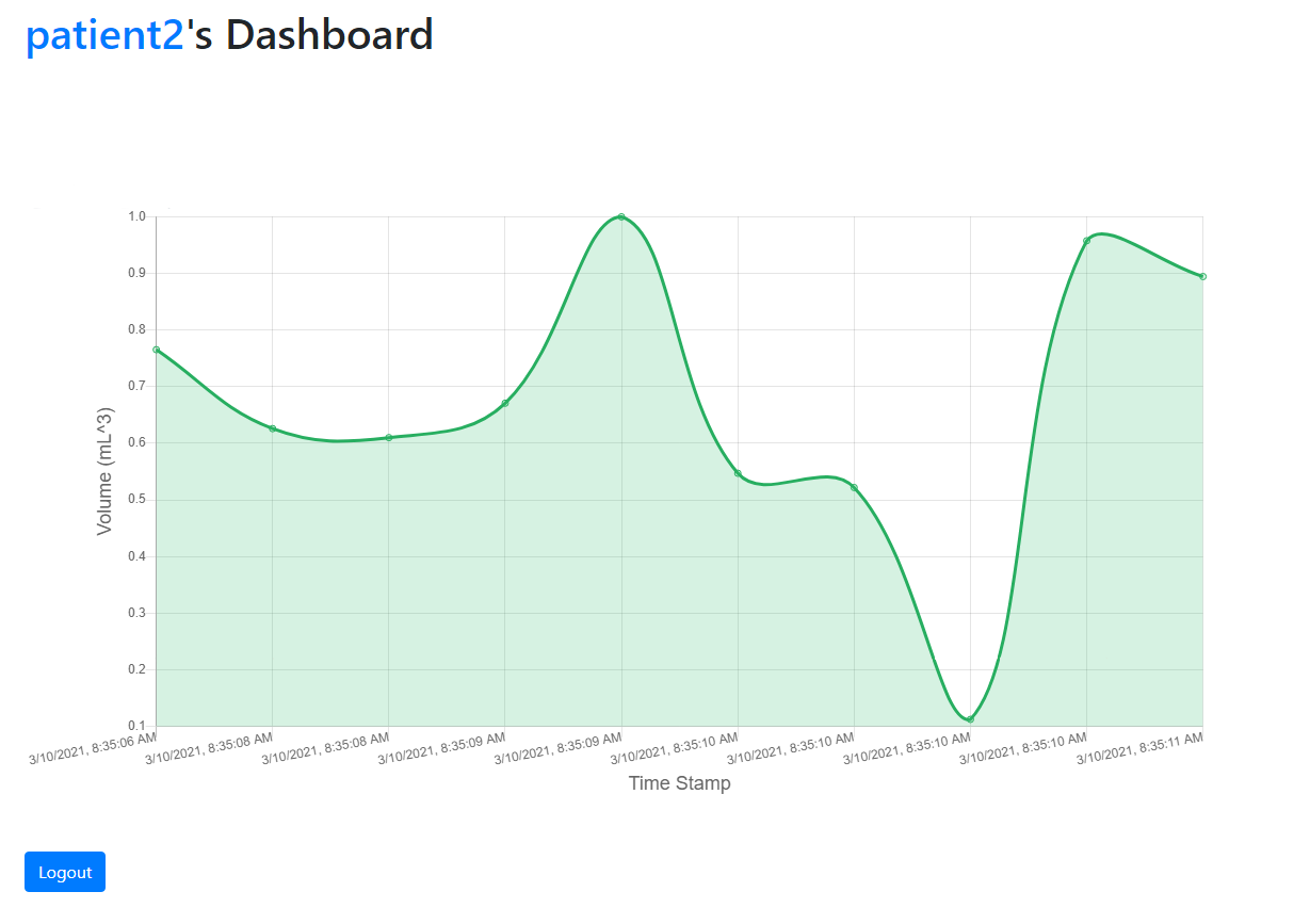
We also used cron job to schedule to continuously run the genFeeds.py file to give us a large amount of data to be used. Cron job is a time-based job scheduler that gives the ability to do repetitive tasks. In our case, we used it to run the genFeeds.py file every 30 minutes, simulating the data fetched from the infusion pump every 30 minutes. We also make sure that all these data will be stored in the database and will not be discarded at any point.
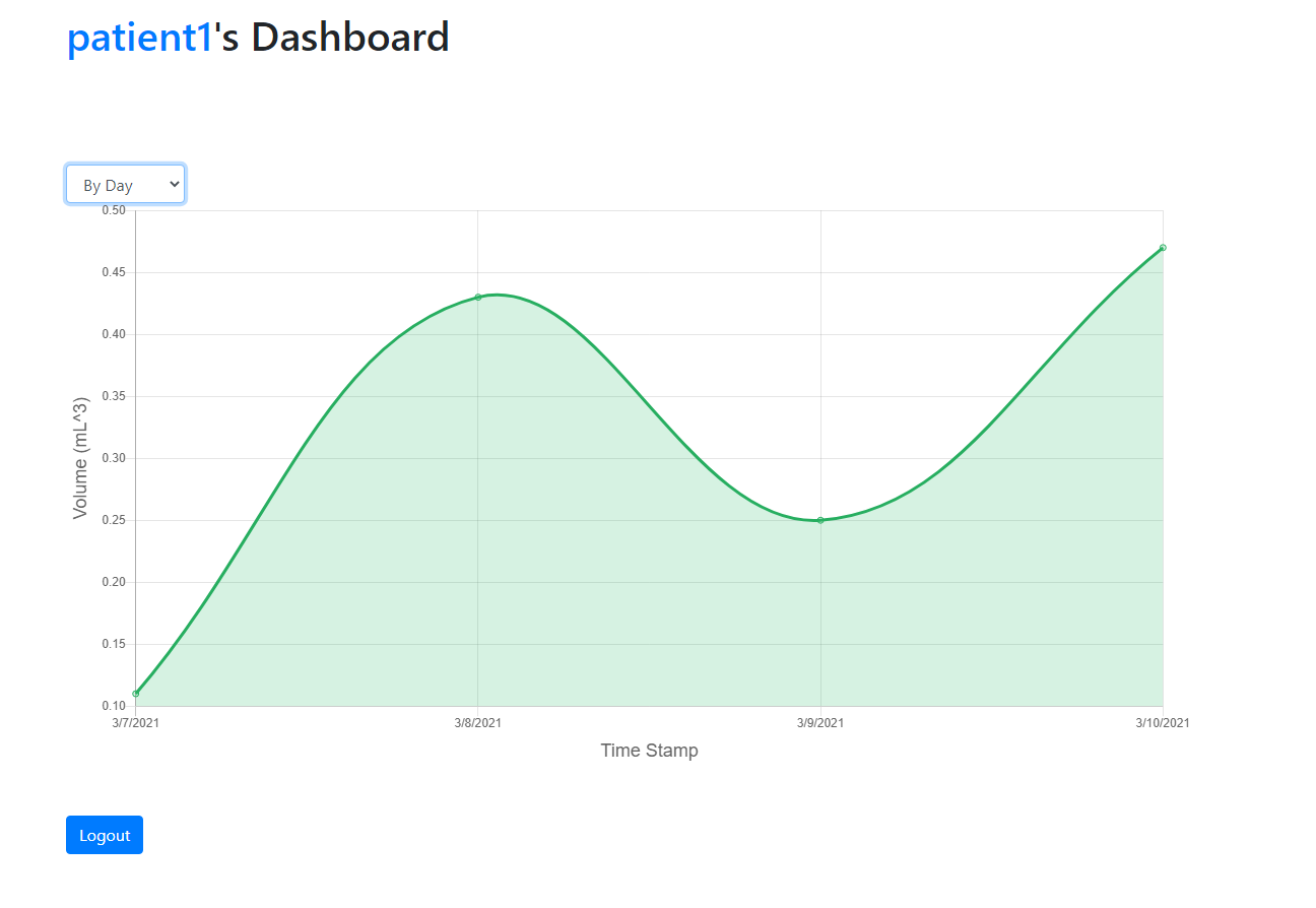
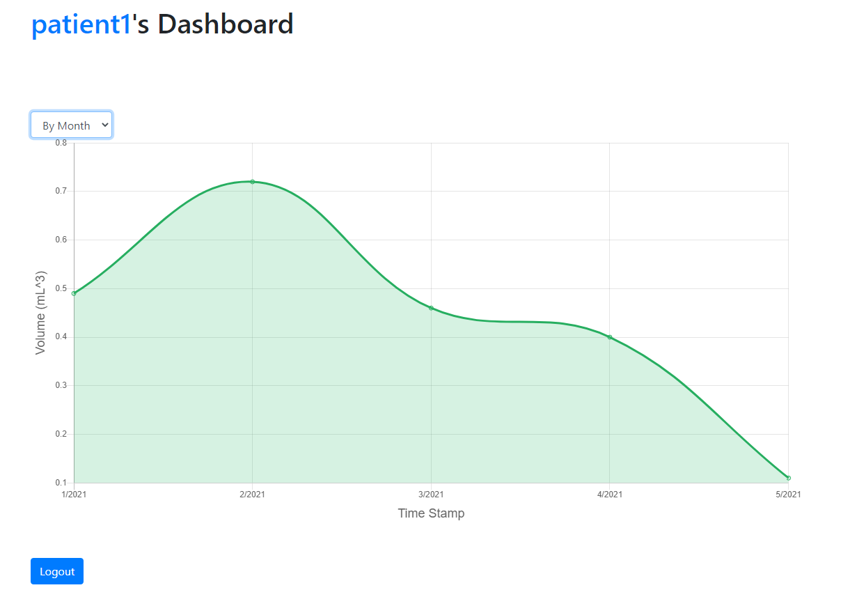
Dashboard - Sort by day
Another functionality we have added is the ability to show the line graph in different ways. Our previous graph was only capable of showing all the data we have collected, but it can be confusing and hard to keep track of to the user. Therefore, we decided to make the graph visible also by year, months and day. We have done this by implementing an option bar to let the user choose how they want to display. The option will be passed to the LineChart as a filter option when triggering onchangeFilter. On LineChart, we have added a function filterFeed to change the display accordingly. After determining what the filter option is, it will get the timestamps and feed data from the database.
Next Steps
In the next week, we will be adding the ability to overlay the treatment graph on top of our original graph. This is one of our key functionality for comparing the prescribed feed to the actual feed received from the pump. We will also improve on the visualisation of the dashboard since it can be hard to see a particular range of data right now.