Summary - Term 2
Overview
With most of the preparation finished in the last term, we have been focusing on the development side of the project throughout this second term. Documentations are also being added alongside the development process. After that, we did thorough testing of the program and deployed the app onto our server which gave us our final product.
You can also look into the details of the project in our portfolio
Development
The development process has occupied most of our time in this term. Since we have already familiarised ourselves with the tech stack the last term, we began straight by first creating the essential pages for our app, then keep on adding extra functionalities according to the MoSCoW requirements list and client feedbacks.
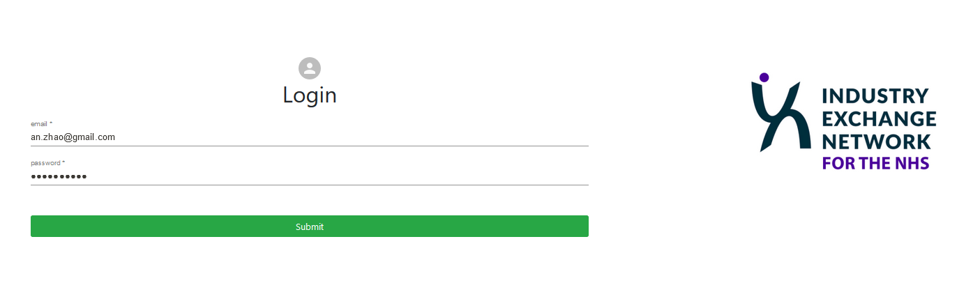
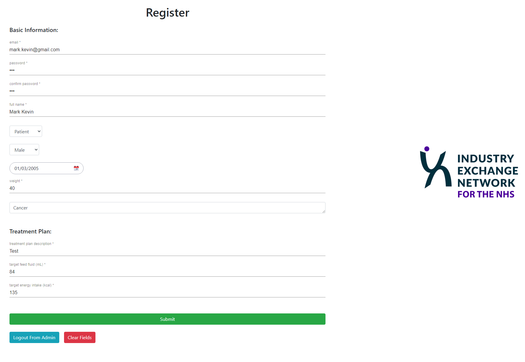
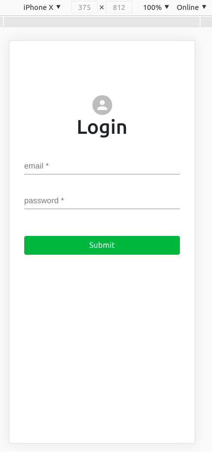
Register and Login Page
First, we started development with the register and login page because we think that the authentication system is very important for the users. Both register and login page utilized pool.query. However, the difference is the register page inserts data into the database and the login page performs a query and gains data from the database. Also, the authentication system will assign a JWT to each valid user to track their login status.
Paitent Dashboard
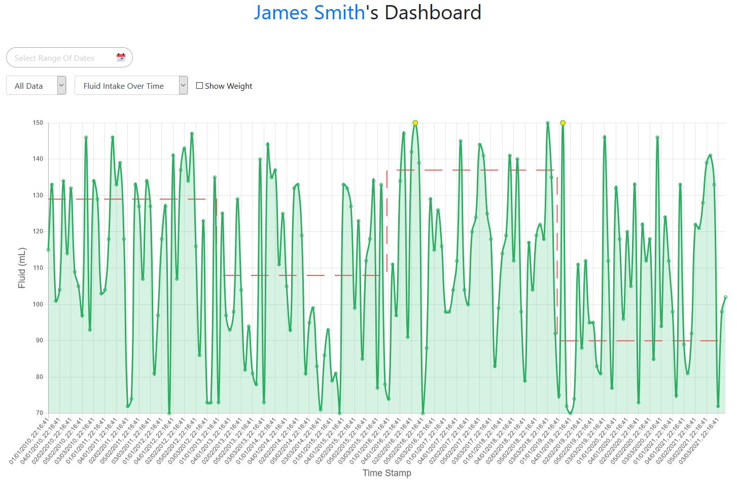
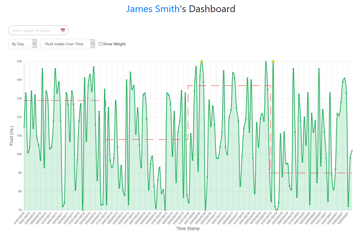
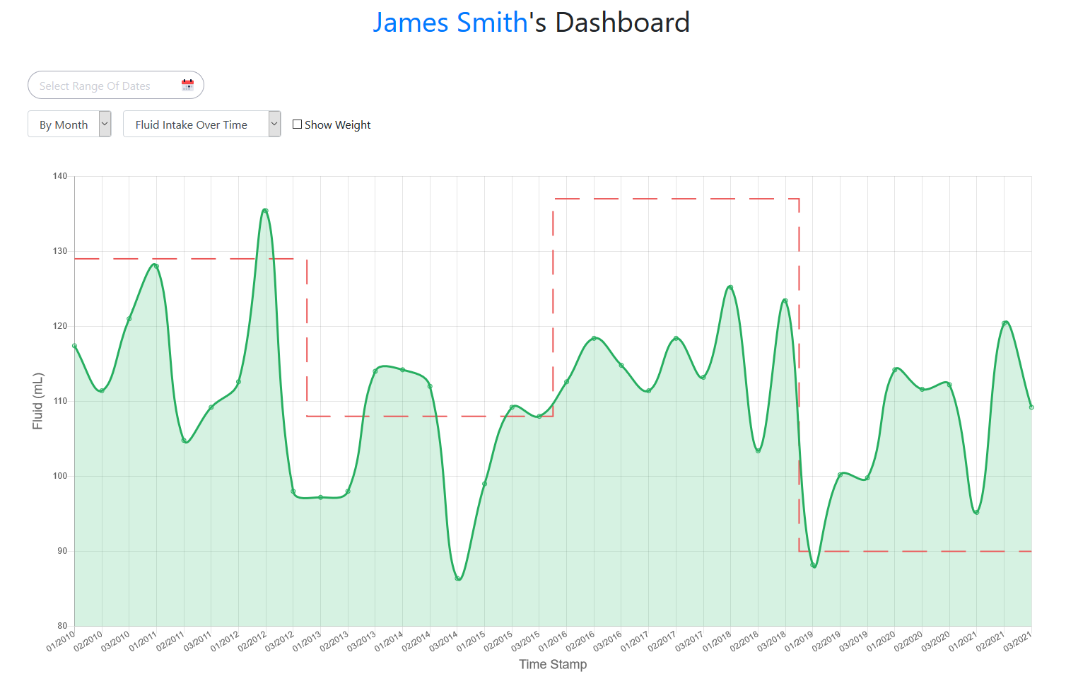
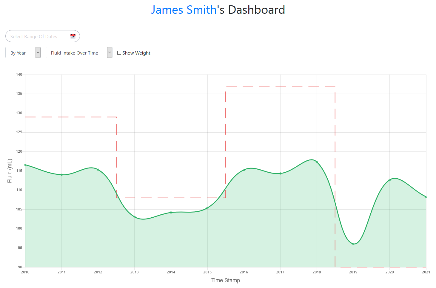
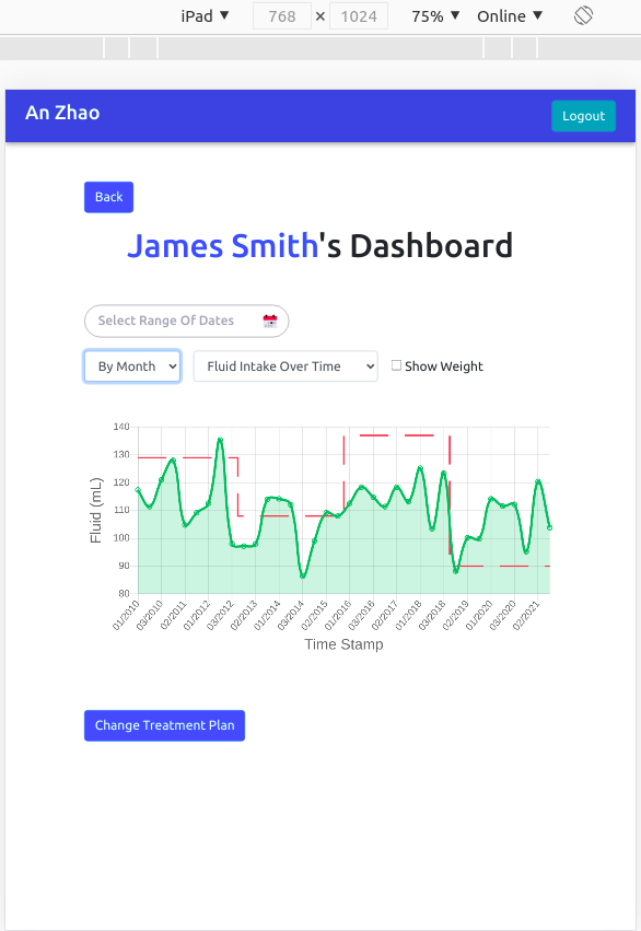
Developing a highly customisable dashboard is the main focus of this project. The patient dashboard page will be where the treatment data will be visualised. It will display the feed data graphs which is a Linechart component that imports form react-chartjs-2.
Functionalities on this page include filtering the data, select data type, add feedback and change treatment plan (clinicians only).
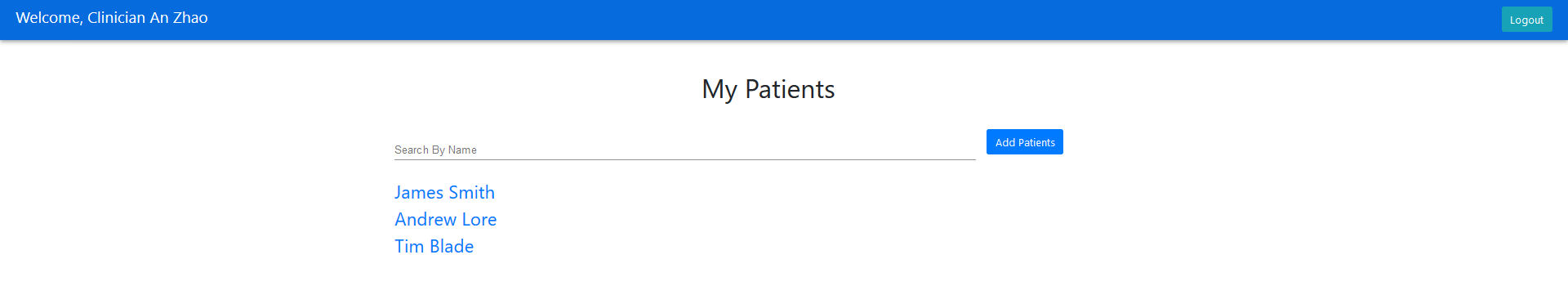
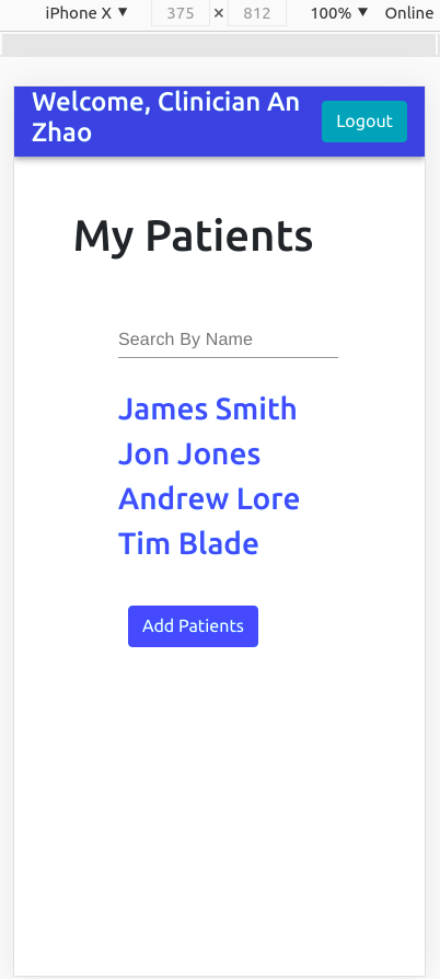
Clinician Dashboard
On the clinician dashboard, it shows the list of patients supervised by the clinician. This page is only visible by a clinician. When the patient’s name is clicked, it will redirect to that patient’s dashboard. The main functionality here will be Add Patients which the clinician will be able to assign patients they supervise so that they will not see the patients they are not looking after.
Functionalities
Target Feed
On the patient dashboard page, there will be a target feed graph in red dotted line overlayed onto the feed graph. This allows both clinicians and patients to compare the prescribed feed and target feed, thus reviewing the feed quality.
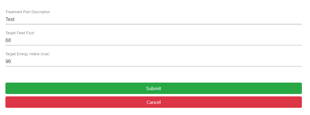
Change Treatment Plan
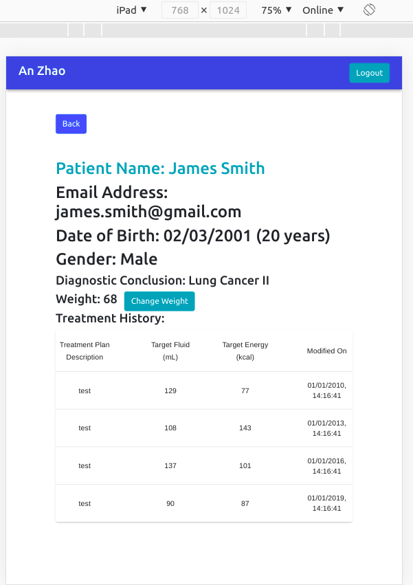
Clinicians will be able to change a patient’s treatment plan to revise the prescribed feed for patients. In the change treatment plan form, which is below the patient dashboard by clicking the Change treatment plan button, the clinician will set the target feed volume and the target energy intake. Then, the database will update the treatment plan details by the back-end server performing a pool.query, and then the treatment information inputs will be kept in the table treatments which is then followed by a “Treatment Plan Change Successful!” message.
Last Modification Time
We did this by adding the field last modified time to the table treatments. PostgreSQL provides two types of timestamp, which are TIMESTAMP and TIMESTAMPZ. Both of them can store the date and exact time, however, the biggest difference between them is TIMESTAMP cannot memory the time zone, which means if the time zone of the database server has changed, the time stored in it will not change. But in this project, since we think that the server’s time zone will be changed frequently, using TIMESTAMP is still a good choice.
After submitting the form of change treatment plan and saving the information to the table treatments in the database, the database server will automatically record the time of data input by timestamp.
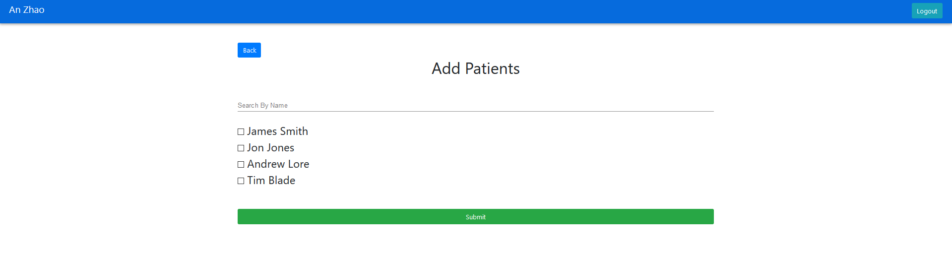
Add Patients
This page is redirected to when the Add patients button is clicked on the clinician dashboard page. On this page, there will be a list of all patients stored in the database and the clinician will be assigned only the ones they are supervising by using the checkbox next to the patient names. This is because clinicians will only see the treatment data of the patients they are taking care of. This means if the patient is being added, the name of that patient will appear on the list on Clinician Dashboard page. As a patient is added, the user_perms will update, user_id is the id of the clinician and patient_scope is the id of the patient. In this way, the clinician can manage their patients conveniently.
Generating Feeds
To be able to simulate the data from the infusion pump, we have added data to the graph by generating feed data from the backend so we can simulate real data is being displayed. As we have no idea what kind of data exactly will be passed from the infusion pump (since there is no way for us to get hands-on an actual infusion pump), we did this to imitate the concept and functionality of the app. We created a genFeeds.py file that generates random dates and feed data with Math.random. The data generated will be then pushed and stored in the database, so it can then be used to visualise the line graph.
We used cron job to schedule to continuously run the genFeeds.py file to give us a large amount of data to be used. Cron job is a time-based job scheduler that gives the ability to do repetitive tasks. In our case, we used it to run the genFeeds.py file every 30 minutes, simulating the data fetched from the infusion pump every 30 minutes. We also make sure that all these data will be stored in the database and will not be discarded at any point.
Sort by Day/Month/Year
Another functionality we have added is the ability to show the line graph in different ways. Our previous graph was only capable of showing all the data we have collected, but it can be confusing and hard to keep track of to the user. Therefore, we decided to make the graph visible also by year, months and day. We have done this by implementing an option bar to let the user choose how they want to display. The option will be passed to the LineChart as a filter option when triggering onchangeFilter. On LineChart, we have added a function filterFeed to change the display accordingly. After determining what the filter option is, it will get the timestamps and feed data from the database.
By Day.
By Month.
By Year.
Filter Date
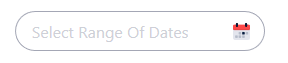
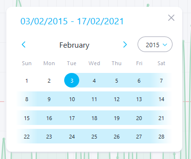
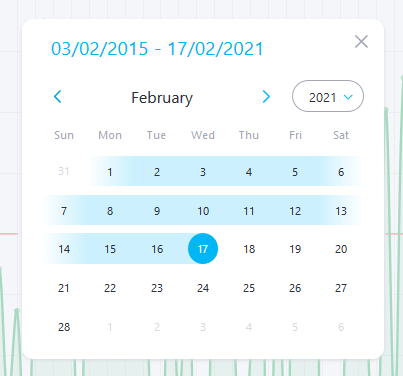
This is another feature that allows users to view specific data on specific dates. We achieved this with the user of RainbowDatepicker from react-rainbow-components. It allows user to have a popup of a calendar to pick two dates which are the start and end date of the desired range. We then get that date and format it using fornmatDates to get the range of the date. Only the data within the range will then be determined and displayed on the graph.
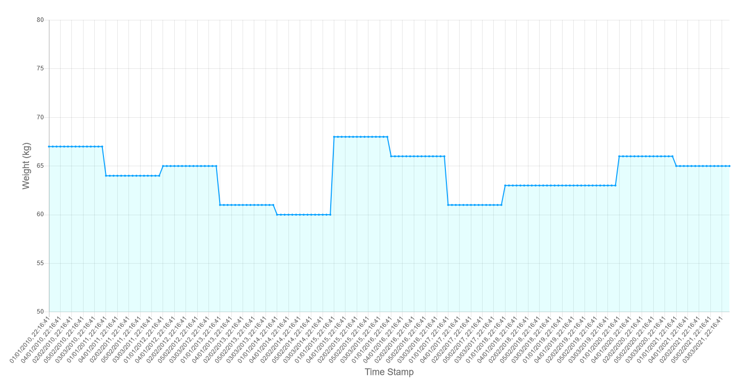
Weight Graph
Our client reflected that a weight graph would be useful since they can extract information by comparing the change in weight to the feed rate. We decided then to overlay the weight graph onto the feed graph.
On the patient dashboard, we have added a showWeight check box which when on click, will show the weight graph. This is done by adding a weight graph to the LineChart component. To do this, we need to map the weight data using a findWeights function which returns the weights within the timestamp. The value of the weights will also be multiplied by a constant so that it will be in a similar range as the feed rate so that it can be better viewed.
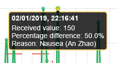
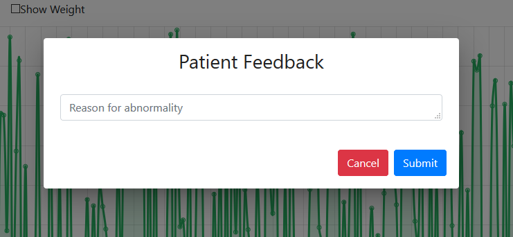
User Feedback System
This feedback system is for clinicians or patients to leave a message on specific data points on the graph. This enables them to explain what happened at that moment which may justify the anomaly. We have added a component Modal which is a popup for the user to submit their feedback. After it is entered, the message will be stored in the database. Users will be able to view this by hovering on the point and there will be a new column patient_feedback added.
We later also changed the colour of the point if it is commented so that it is more visible on the graph. The feedback is also annotated with the user who gave the feedback, making it easier to track the messages.
Refactoring
After all the functionalities were implemented, we have refactored our code using Redux which is a library with a simple API, designed to be a predictable container for the application state. It operates similarly to a reducing function, a functional programming concept that is great for improving state management. We have modified using useSelector and useDispatch throughout the whole program. Selector helps with storing minimal state by deriving data from the state when it is needed, so this helps avoid repeating logic as different parts of the app need to read the same data. A Dispatch makes the only way to update the state by calling store.dispatch and pass in an action object so that the states are better managed and will not be updated elsewhere. The Provider is also used is our index.js which allows the Redux store available to any nested components which we have wrapped our entire app with.
Documentation
User Manual
We did the user manual as we have finished all the functions and UI design. This can act as a tutorial for the users to be able to get familiar with the web app and understand the functionality clearly.
We have four pages for the user-manual and the pages are Home, Getting Started, Clinicians and Patients. Home page contains a piece of welcome information, an abstract of our project and a list of shortcuts for the users the contents they want quickly. The Getting Started page is like a condensed version of the whole user manual. It consisted of some important functions, but they are not described in details. Since we have two roles in this web app, clinicians and patients, thus, this user manual also describes how to use the web app for both two roles. On both the Clinicians page and Patients page, we provide a lot of detailed descriptions and screenshots for every single step to make sure that the users can follow with us and never feel confused.
Our user manual documentation can be found here.
Deployment Manual
As our app is deployed, we have added a thorough ReadME in our GitHub repository https://github.com/COMP0016-Team6/NHS-Patient-Dashboard which has very detailed step-by-step instructions to run the application locally and to deploy it on a Linux VPS of any cloud providers (AWS, Digital Ocean, GCP, etc.).
There is also the same deployment manual is available on our portfolio website here.
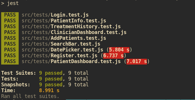
Testing
We have done comprehensive testing for our application to ensure the quality of our program. This is very important for us to cover all the scenarios so that we can be certain that the system is functioning correctly.
We have multiple tests for different aspects of the application:
Front end – Snapshot Testing
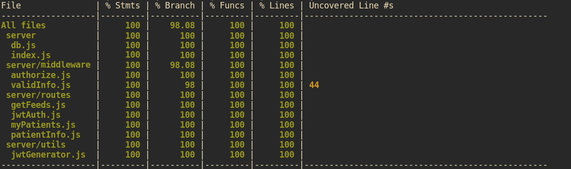
Back end – Unit and Integration Testing
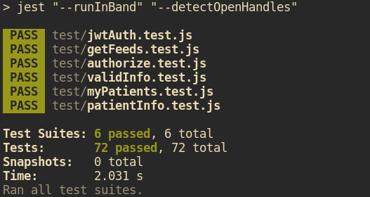
End-to-end Test
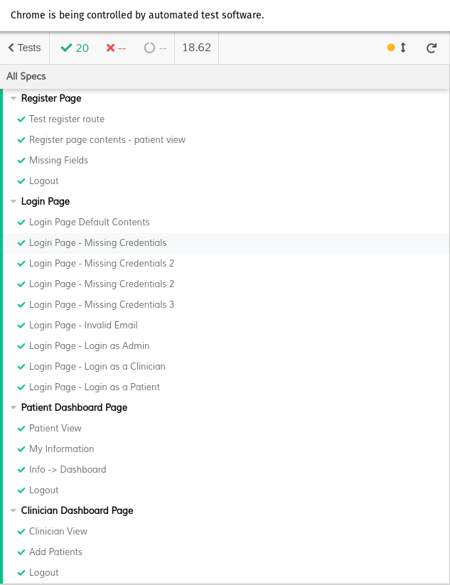
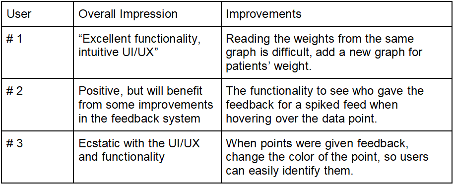
User Acceptance Tests
Responsive Design Tests
Deployment
We decided to deploy the application on the Virtual Private Server (VPS) with Digital Ocean, as Daulet had previous experience deploying a full-stack application there. We nicely wrapped up our code, added Dockerfiles, as well as extracted all the database credentials, admin passwords in environment variables, added baseURL variables, and prepared the codebase to be deployed.
We have set up our PostgreSQL database on the server-side, and run the database.sql script to create the suitable schema. We seamlessly installed all the dependencies for the Node.js backend and used pm2 for running the Node.js server.
Then we have configured the Nginx web server and reverse proxy, and have successfully deployed the application at https://dauletbatayev.com/ for demonstration purposes.